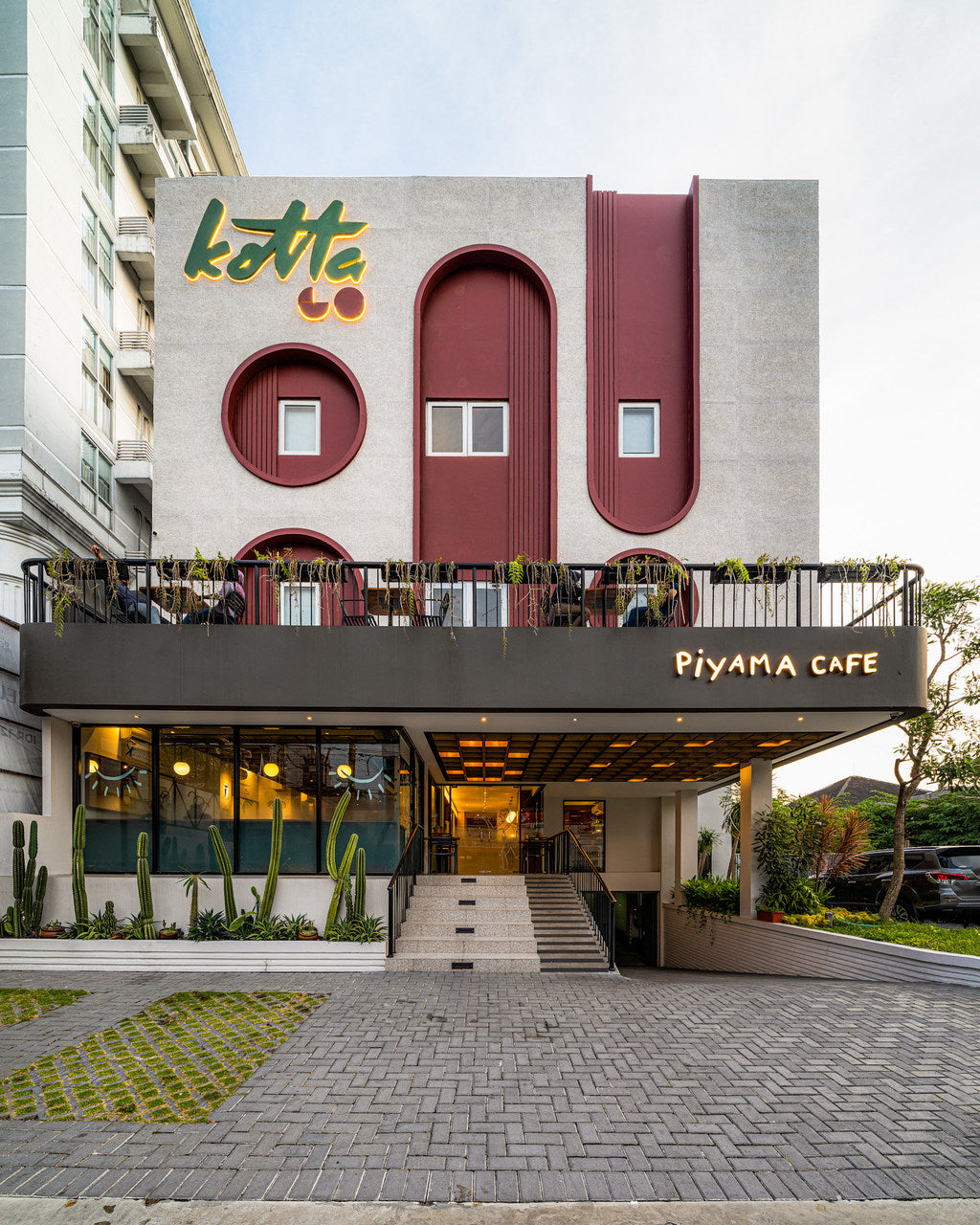
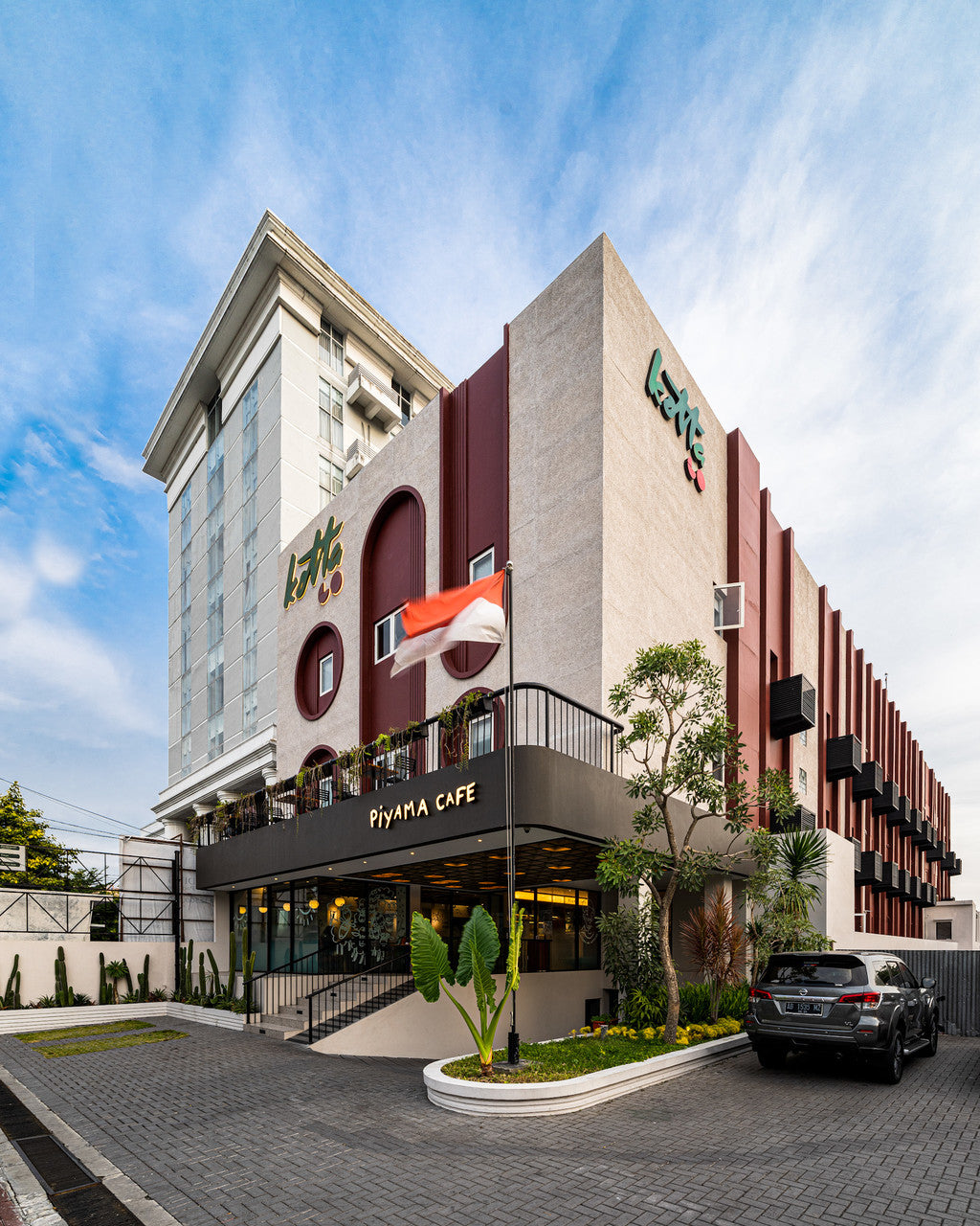
KOTTA Go Yogyakarta is part of the KOTTA Hotel Group, a new hospitality brand that reimagines city hotels with a youthful, playful spirit. Situated in the heart of Yogyakarta, this renovation project caters to short getaways, staycations, and business travelers seeking a memorable yet accessible experience.
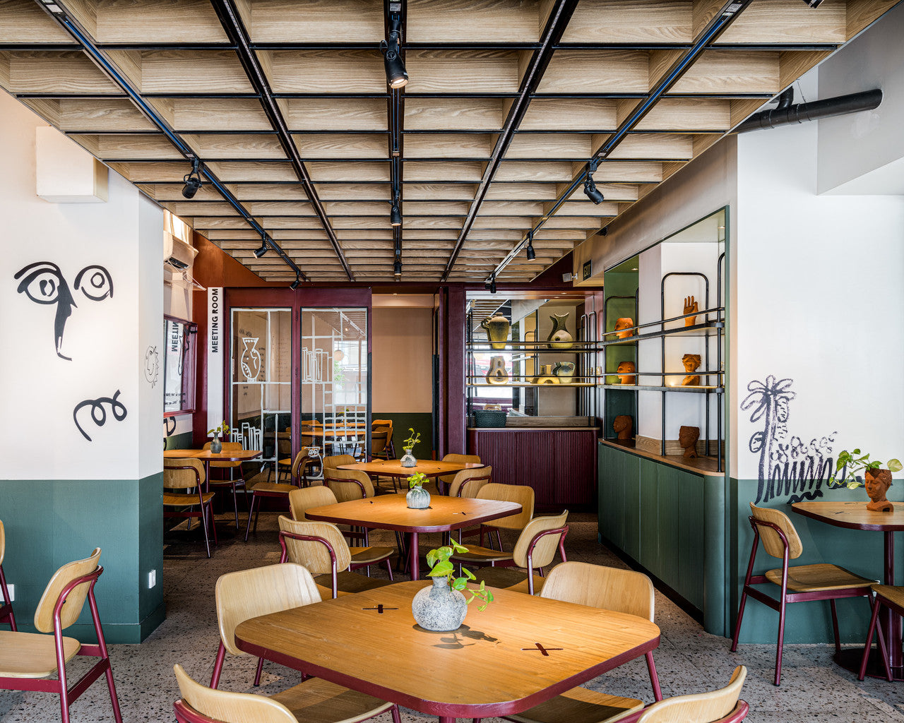
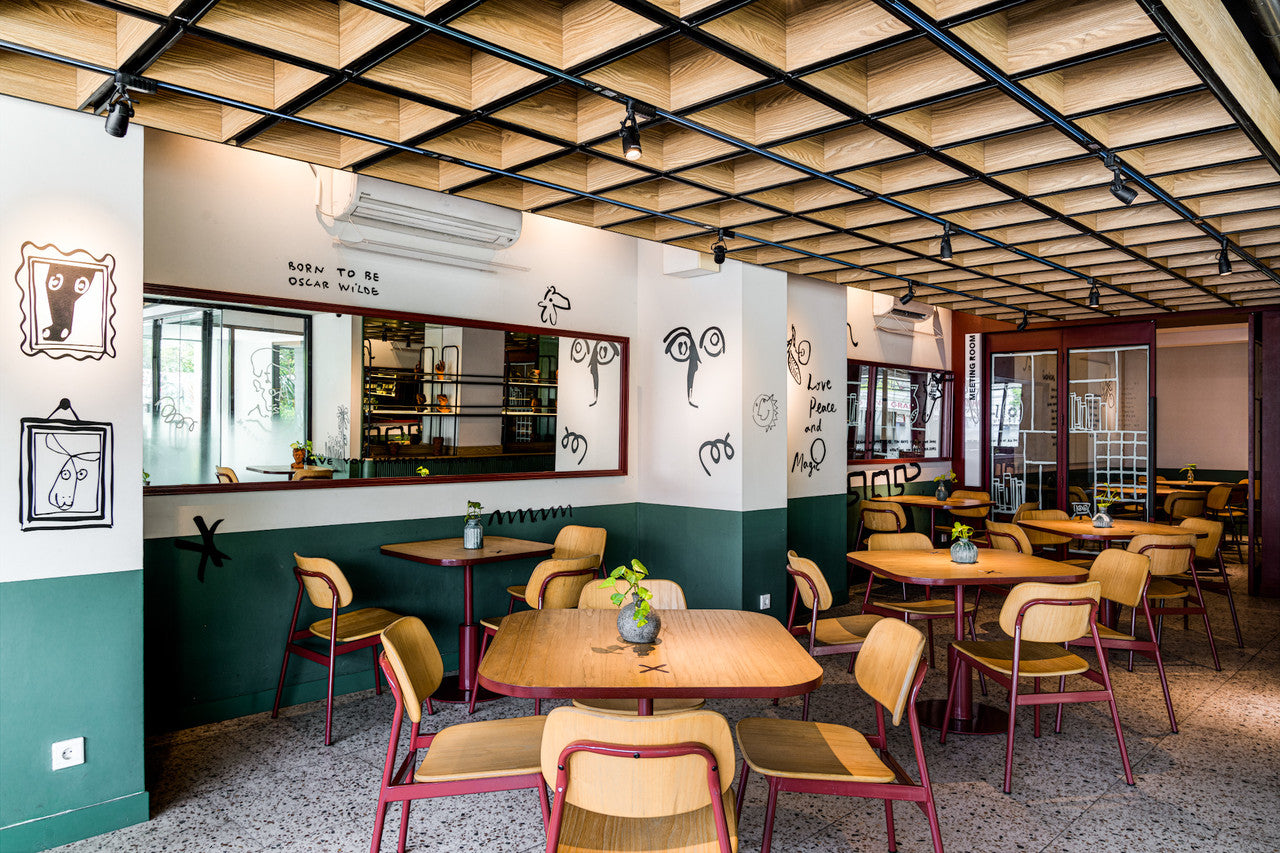
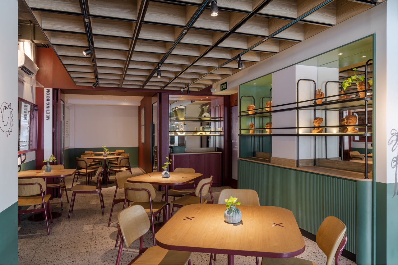
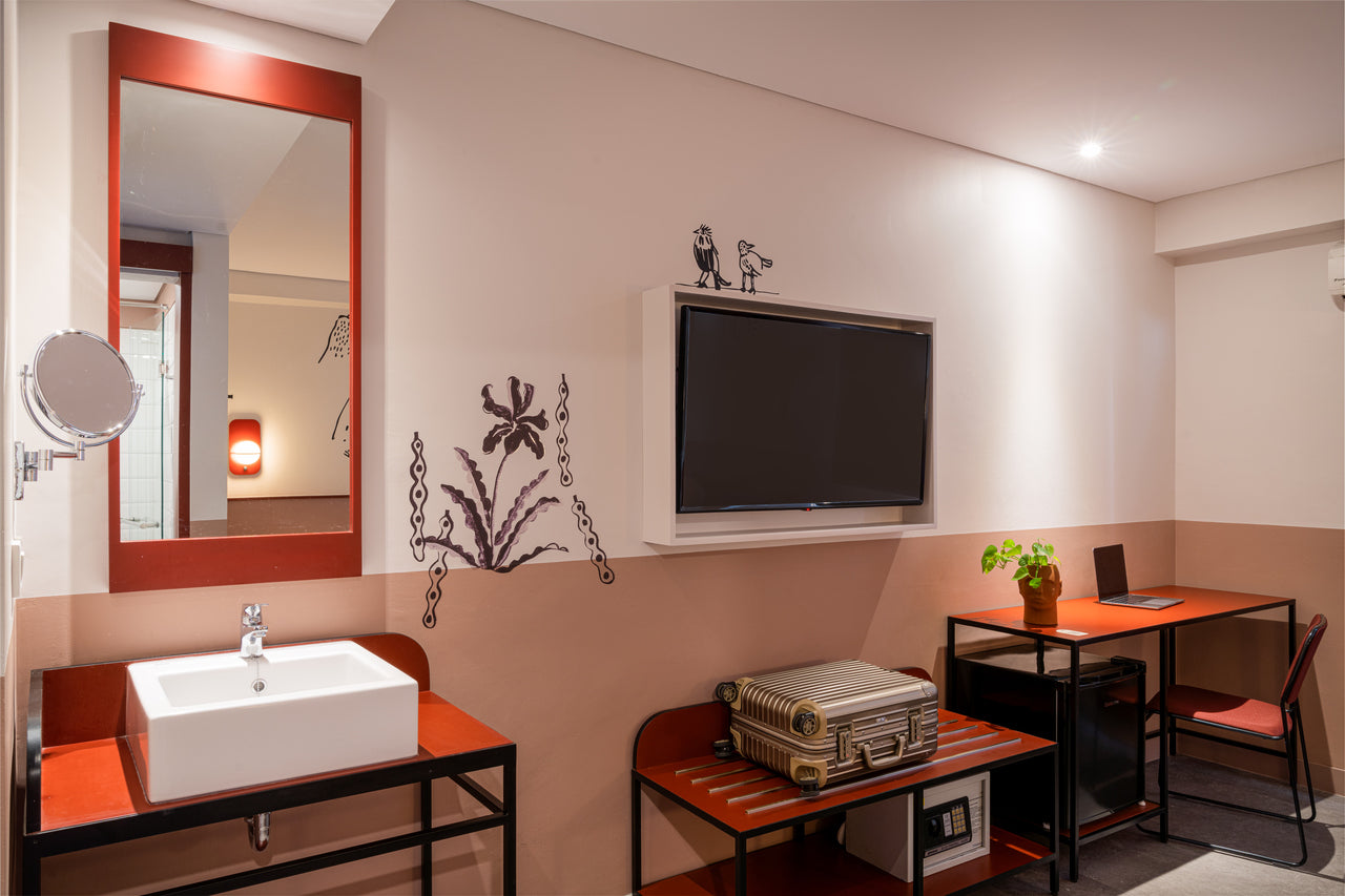
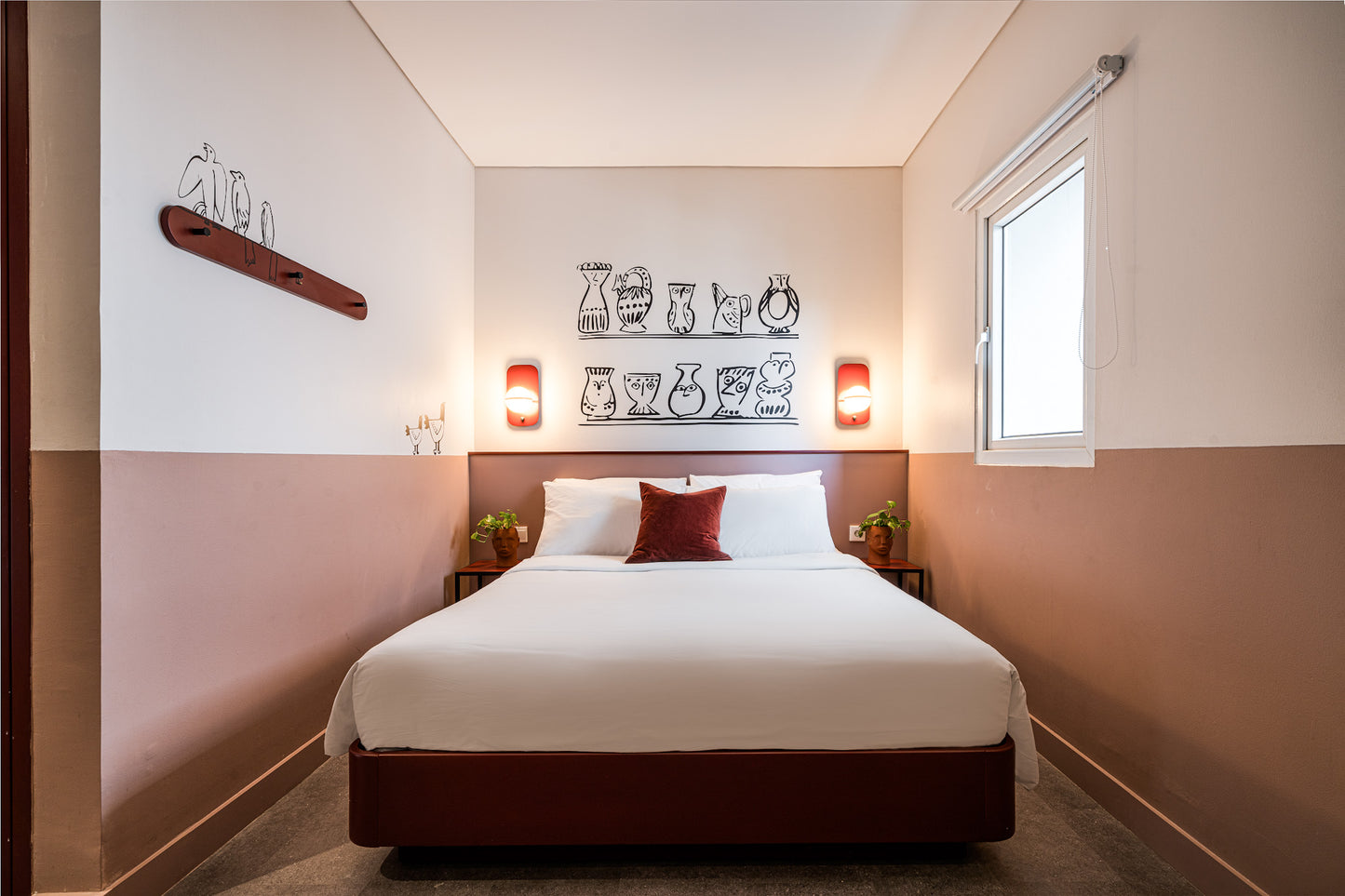
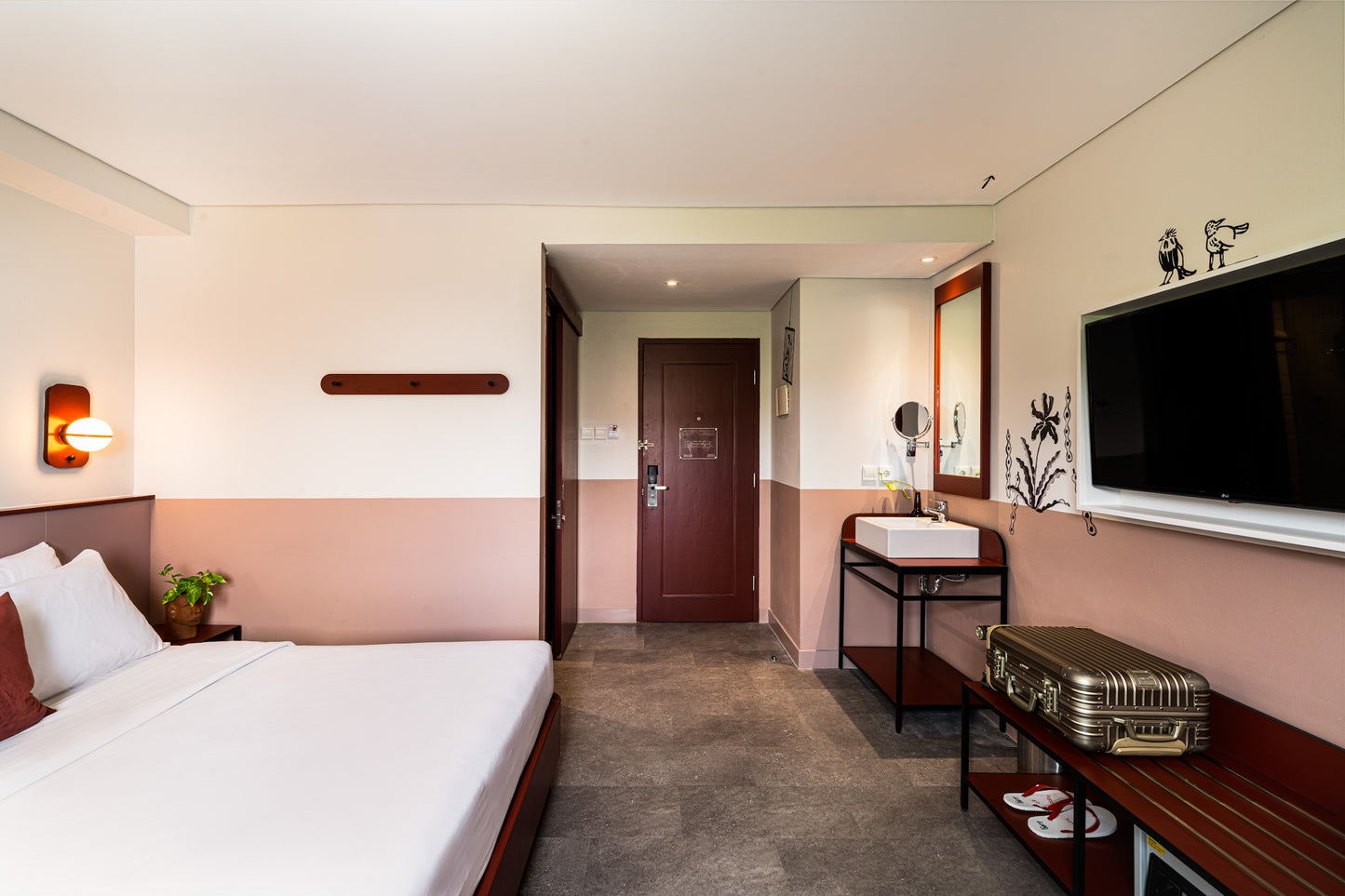
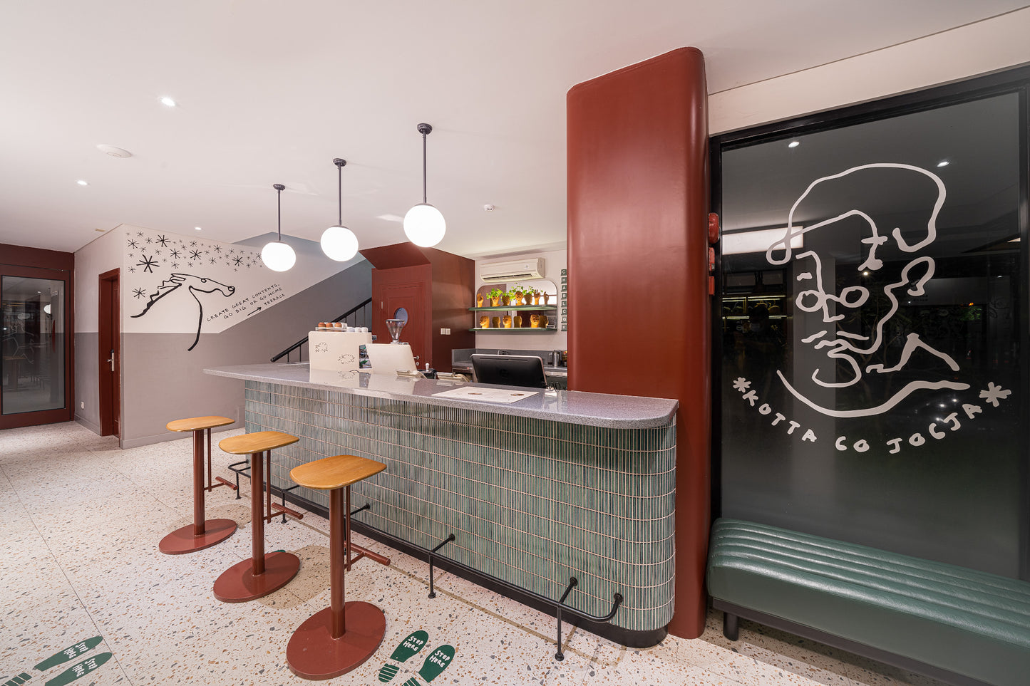
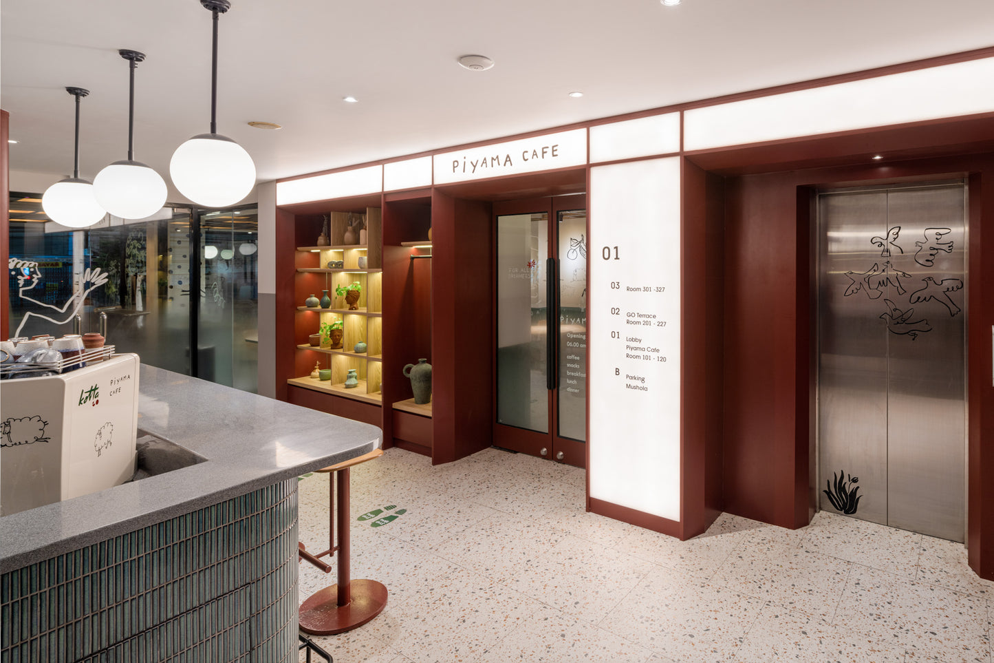
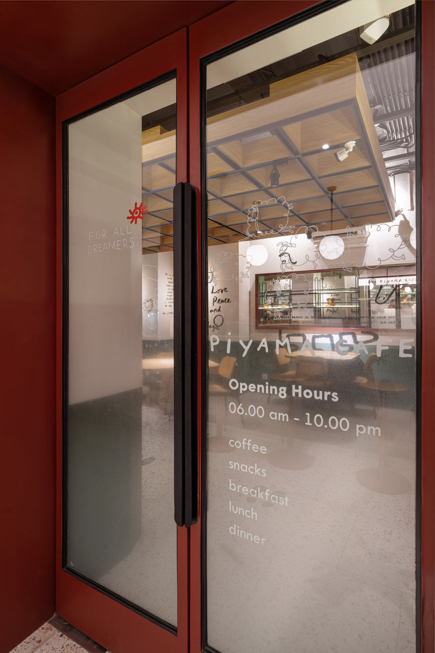
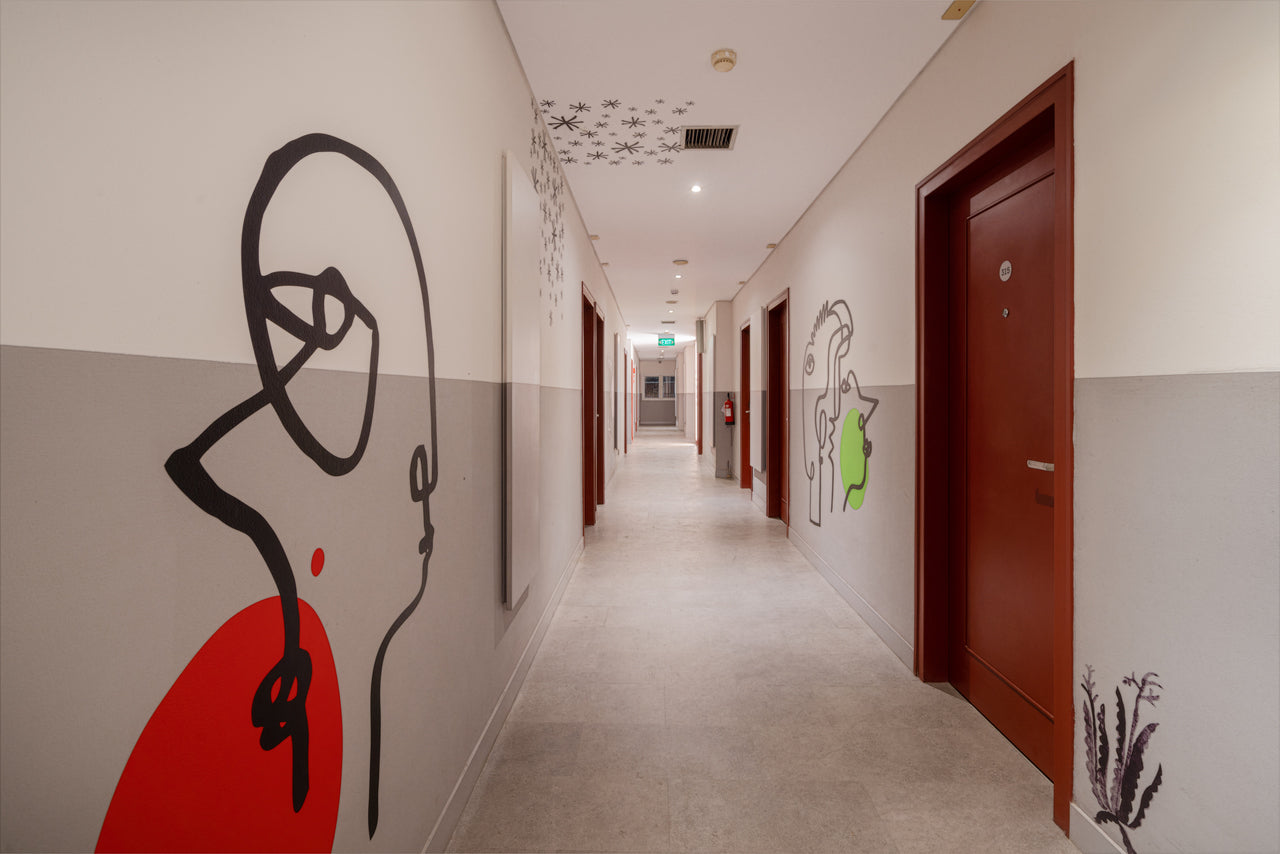
At the core of the design brief was a balance: practical and budget-efficient, but also vibrant, distinctive, and appealing to a younger market. Our approach embraced bold graphic gestures applied with simple, accessible materials such as painted surfaces, HPL, and Oracal wall stickers.
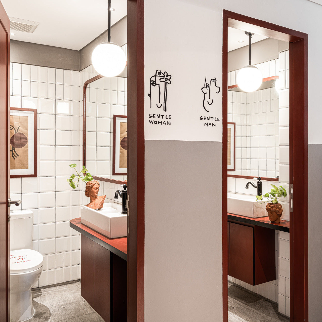
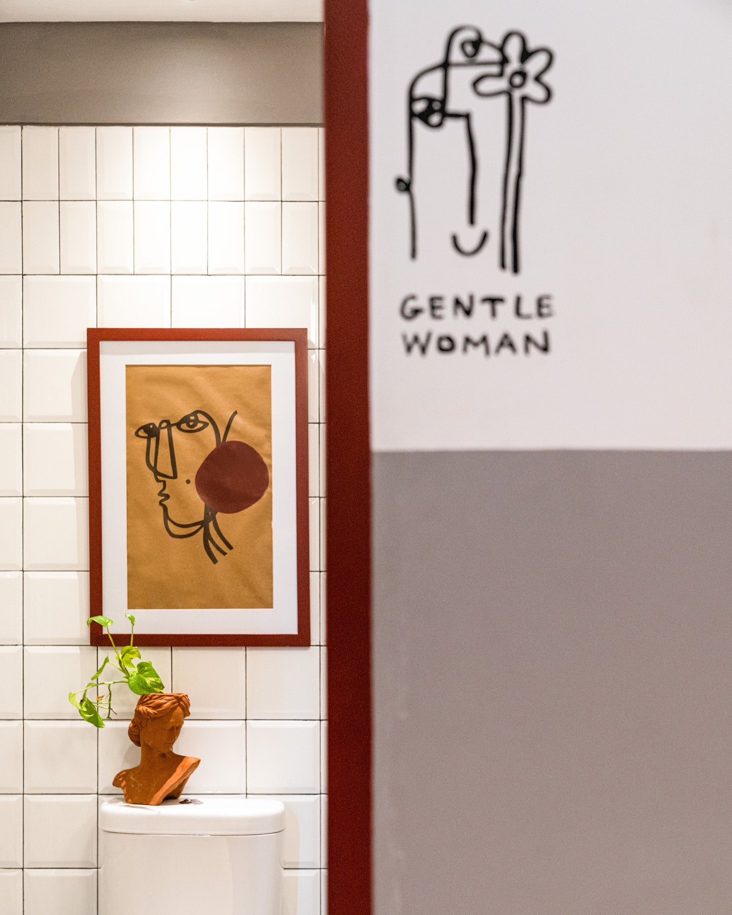
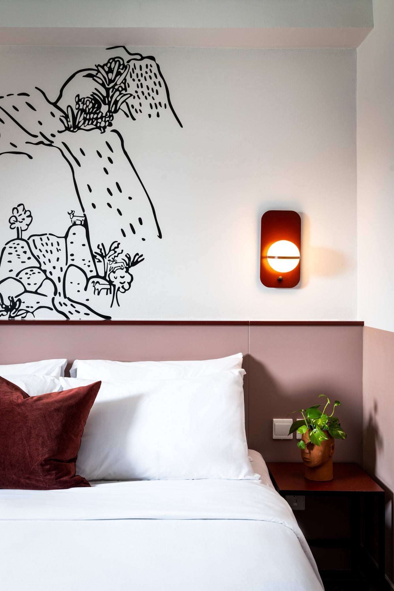
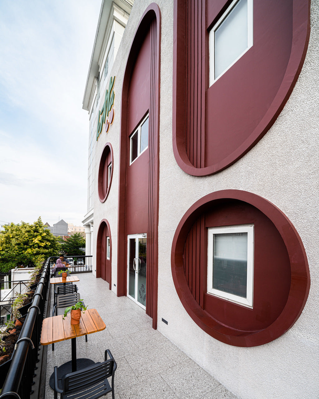
A defining element of the project is the use of Terracotta Red as the accent color. Chosen not only for its warmth, the color carries symbolic depth—conveying stability, grounding, comfort, and a connection to timeless craftsmanship—values that resonate with the KOTTA Go brand philosophy.
We collaborated with Droite Studio, who developed the hotel’s branding and the whimsical doodles that animate its spaces. These doodles are not merely decorative; they narrate Yogyakarta’s scenery and culture, embedding a sense of place into the guest experience. Each KOTTA property will carry its own doodle story, inspired by local folk tales and traditions, ensuring a unique identity while keeping the brand cohesive.
Our scope also extended to the hotel façade, which was designed as a head-turner in the city center—bold and approachable, echoing the energy of the interiors.
KOTTA Go Yogyakarta is more than a renovation project; it is an exercise in narrative-driven design, where color, graphics, and local storytelling come together to craft a hospitality experience that is both contemporary and rooted in place.